- Chronology
- Before 1500 BCE
- 1500 BCE to 500 BCE
- 500 BCE to 500 CE
- Sixth to Tenth Century
- Eleventh to Fourteenth Century
- Fifteenth Century
- Sixteenth Century
- Seventeenth Century
- Eighteenth Century
- Nineteenth Century
- Twentieth Century
- Twenty-first Century
- Geographic Area
- Africa
- Caribbean
- Central America
- Central and North Asia
- East Asia
- North America
- Northern Europe
- Oceania/Australia
- South America
- South Asia/South East Asia
- Southern Europe and Mediterranean
- West Asia
- Subject, Genre, Media, Artistic Practice
- Aesthetics
- African American/African Diaspora
- Ancient Egyptian/Near Eastern Art
- Ancient Greek/Roman Art
- Architectural History/Urbanism/Historic Preservation
- Art Education/Pedagogy/Art Therapy
- Art of the Ancient Americas
- Artistic Practice/Creativity
- Asian American/Asian Diaspora
- Ceramics/Metals/Fiber Arts/Glass
- Colonial and Modern Latin America
- Comparative
- Conceptual Art
- Decorative Arts
- Design History
- Digital Media/New Media/Web-Based Media
- Digital Scholarship/History
- Drawings/Prints/Work on Paper/Artistc Practice
- Fiber Arts and Textiles
- Film/Video/Animation
- Folk Art/Vernacular Art
- Genders/Sexualities/Feminisms
- Graphic/Industrial/Object Design
- Indigenous Peoples
- Installation/Environmental Art
- Islamic Art
- Latinx
- Material Culture
- Multimedia/Intermedia
- Museum Practice/Museum Studies/Curatorial Studies/Arts Administration
- Native American/First Nations
- Painting
- Patronage, Art Collecting
- Performance Art/Performance Studies/Public Practice
- Photography
- Politics/Economics
- Queer/Gay Art
- Race/Ethnicity
- Religion/Cosmology/Spirituality
- Sculpture
- Sound Art
- Survey
- Theory/Historiography/Methodology
- Visual Studies
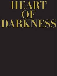
On Fiona Banner’s website, her publication Heart of Darkness is referred to as a magazine. On the publisher’s website it is referred to as a book in magazine format. Straddling these two categories, Heart of Darkness embodies multiple dualities and contrasting conditions, in line with the body of work Banner has been developing over the past two decades. The publication is part of Four Corners Books’ series Familiars, which pairs a classic novel with a contemporary artist’s interpretation of the text, resulting in highly experimental new editions. Banner’s Heart of Darkness, based on Joseph Conrad’s novel, is the twelfth volume in the series, which also includes texts such as Oscar Wilde’s The Picture of Dorian Gray, Bram Stoker’s Dracula, and W. M. Thackeray’s Vanity Fair, among others—and each volume stages a conversation between the contemporary context and timeless questions of the human condition. This new edition of Heart of Darkness is also a co-publication of Four Corners Books and the Vanity Press, Banner’s own pseudonym-cum-publishing house.
Banner’s first encounter with Conrad’s narrative was through film, namely, Francis Ford Coppola’s iconic Apocalypse Now (1979), which transferred Conrad’s story of violence, greed, and moral corruption to the context of the Vietnam War. In Banner’s interpretation of Heart of Darkness, the narrative is transferred to yet another context—that of contemporary London, more specifically, the center of the financial and banking industry. In what appears to be an act of intentional mirroring, Banner commissioned the Magnum photographer Paolo Pellegrin to shoot the images featured in the book. The collaboration with Pellegrin took place in association with the Archive of Modern Conflict, a diverse and idiosyncratic collection of photographs and ephemera tracing not only the eruptions of wars and conflicts over the past century and a half, but also the development of the photographic medium. While working on a project for an exhibition with the archive, Banner discovered a lack of material from the contemporary context. In the commission for Heart of Darkness, Pellegrin, who has worked predominantly in conflict zones and whose recent work has taken him to the heart of Africa and the Congo, has photographed the city of London—its people and places, customs and costumes—through the lens of Conrad’s text.
The book in magazine format is a formidable object. It is not designed simply to be read, certainly not in the linear fashion most novels are designed to be consumed. Oversized, heavy, and glossy, meant to be laid down on a coffee table and flicked through, rather than held up to be read, the look and feel of Heart of Darkness certainly evoke the self-conscious objecthood of a luxury magazine. The jet-black cover with gold-foil lettering, the heavy coated paper inside, and even the typeface of the title mimic fashion magazines such as Vogue, which utilized similar visual devices for special issues in the 1970s and 1980s. Some of the elegantly clad Londoners and the expensively furnished interiors in Pellegrin’s images could easily be models or props selling costly watches or perfumes. But the photographs portray multiple perspectives of the city, not just its rich and powerful inhabitants in their workplaces. The opening pages in the book set the tone and the scene—the dark surface of the Thames stretches in full bleed across double-page spreads.
Most of the images in the book are black and white, sometimes printed in gray scale but occasionally also as duotones, with metallic gold ink alongside deep blacks. High contrasts in the light and shadows of images are exaggerated and emphasized by the gloss of the coated pages. The layout is dense, and full-bleed images spread over whole pages or double-page spreads, often spanning four or five spreads before the reader encounters another page of text. Many images engage directly with the text: boats on the river, imposing colonnades and doorways, a woman wearing high heels and tights with an image of a snake, evoking the snaking Congo River. In most cases though, connections between images and text are more subtle. Leafing through the book, the reader can construct a narrative based around the photographs alone. The themes that run through this photographic essay echo Conrad’s text, except for the time and the place, which are here and now.
A further duality, or multiplicity, of meanings can be observed in the drawings of pinstripe suit patterns interspersed throughout the book. The patterned pages become progressively more abstract. The curving lines of the stripes bleeding off the edges of the pages could just as easily be interpreted as the wavy surface of the river, a common subject of multiple photographs in the book. The stripes (or waves) are often overlaid with text, snippets of sentences cropped from various sections of the book. Curved along the path of the pinstripes, the sentences are hard to make out in their entirety. This fragmented experience of the text further emphasizes a nonlinear reading. The story appears to be revealed through multiple points of entry into the text, interspersed among the immersive sequencing of images, encouraging the reader to browse, flip through, and occasionally linger.
Despite the strong impact of the images, text plays multiple and important roles throughout the book. In numerous interviews, Banner has described language as her key medium, and her awareness of the materiality of text is palpable in many of her works, from her sculptural Full Stop inflatables to her India-ink performance nudes. Her particular sensibility toward the visibility of language through the physical manifestation of text is explored in various ways in this edition of Heart of Darkness. Text is a prominent characteristic in photographs of crumpled newspapers, building signage, and stick-on advertising, in the price-tags of expensive liquor bottles lining the walls of gentlemen’s clubs, on the face of banknotes and the cover of Lloyds Bank’s “Loss Book.” Typeset text curves along creases in the pinstripe suit patterns and overlays images. Occasionally, it is pulled out and set in an extra large font with just a few lines spanning an entire double-page spread printed in black or solid gold. Even at its most functional level, as body copy, the text stands out and departs from what typographers refer to as the crystal-goblet paradigm. In contrast to this influential concept from early-twentieth-century graphic design, which argues that type in print should be clear and virtually invisible, the body copy in Heart of Darkness fills tall double columns of text on oversize pages and sometimes squeezes into narrow gaps left between photographs and the edges of the paper. Setting justified text in these columns results in occasional rivers of white, a typographic term denoting the coincidental alignment of word spaces running through a paragraph and another possible reference to the image of the river. The text placement, the type size, and layout choices all contribute toward making the reader constantly aware of the text and its physical form beyond the semantic meaning. This must have been a conscious decision by the artist and the designers of the book, John Morgan studio, London.
Banner often collaborates with graphic designers on projects that expand her visual arts practice into the fields of typography and design. Such collaborations question epistemological meaning-making implicit in reading text purely for its content and focus on the production of meaning or knowledge in the act of writing something down and publishing it. Within the context of Heart of Darkness, this is exemplified particularly well in the spreads where images are overlaid with large text captions. With uppercase, bold text set in white and running across the bottom or top of an image, such spreads also evoke the visual language of memes and the ambivalent practices of cultural production online. As media theorist Benjamin Bratton has argued in The Stack: On Software and Sovereignty (Cambridge, MA: MIT Press, 2015), networked culture and the conditions of algorithmic computation have to a large extent not only enabled but also driven the expansion of the global banking industry and current economic conditions, which are at the center of Banner’s critique.
Perhaps this critique is most evident not in what it shows, but in what it does not. Marginalized communities are rendered almost invisible. A single image of empty bedding over pieces of cardboard left on a sidewalk hints at the dispossessed who are still part of the fabric of the city. People of color are also largely absent except for the blurry figures of security personnel. The signs of conflicts that continue to spread division here and now, as they did in Conrad’s original context, are represented in the image of a Chinook helicopter flying over office towers. While as a body of photographic work the book exposes excessive, almost theatrical scenes inside the world of city bankers and financiers, in a time of government-imposed austerity and widespread inequality, it remains ambivalent as to who ultimately bears the cost of modern conflicts.
Lozana Rossenova
PhD Researcher, School of Arts and Creative Industries, London South Bank University